LeadCenter brings you Events Report so that you can view events-related consolidated data and make decisions based on real-time updates. This report consists of graphs, charts, and metrics to display the efficiency of your business operations and steer you toward making smart choices.
Follow the steps given below to access the All Production report:
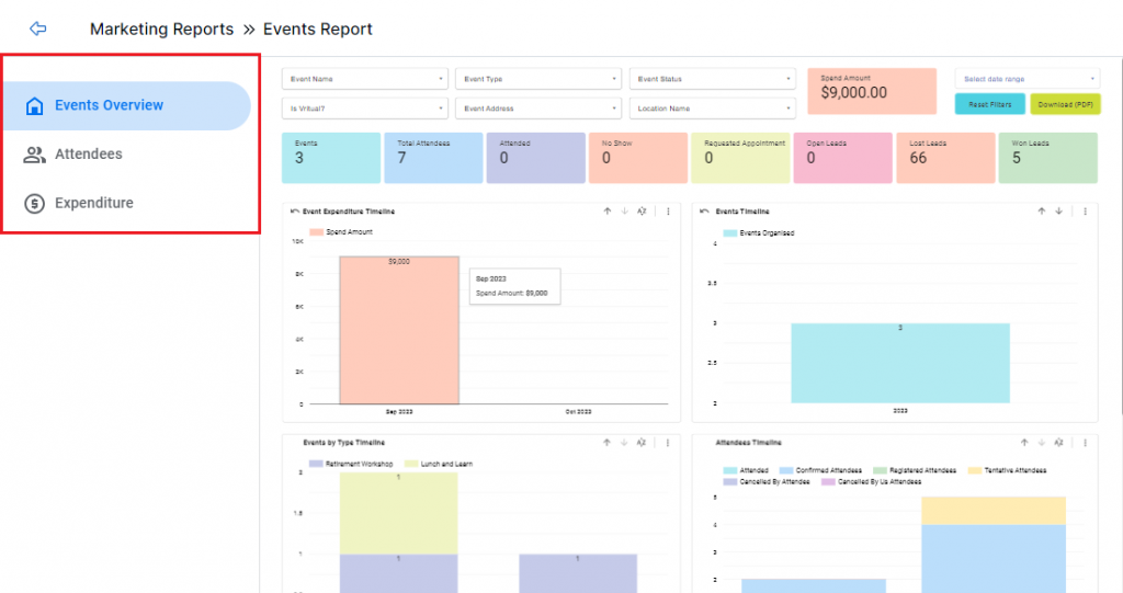
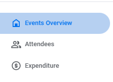
Upon accessing this report, you’ll see three tabs on the left side. Each tab provides a different kind of report. These tabs are:
Note: Some of the filters in each tab are the same.
You can switch between tabs to see the components specific to each tab.
Let’s see the components of the Events Overview report:
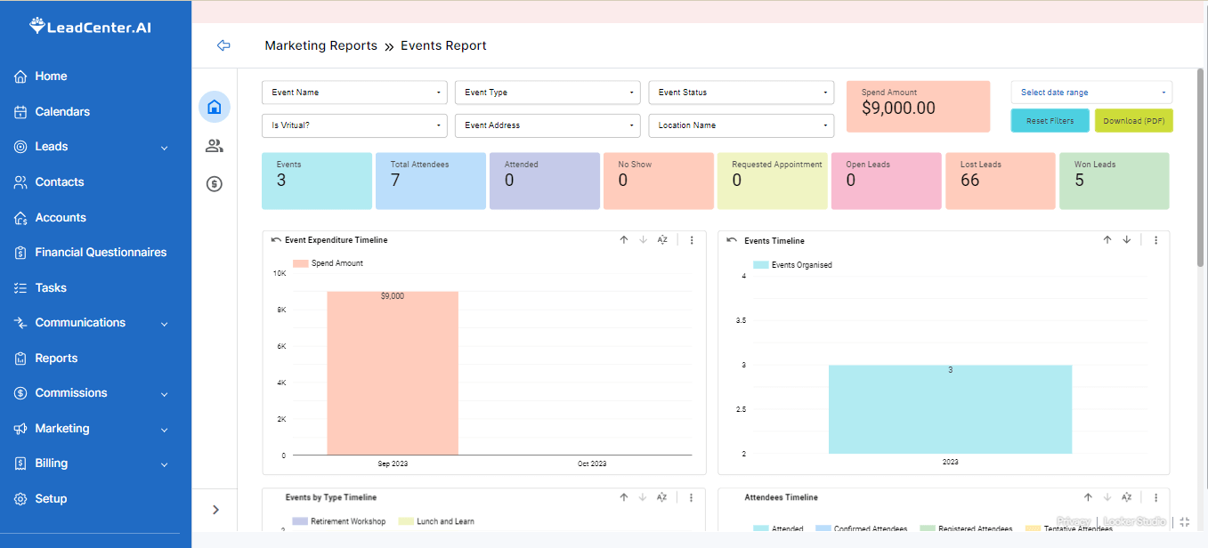
You’ll see the filters on top of the screen. You can click on the required filter dropdown to specify your search.
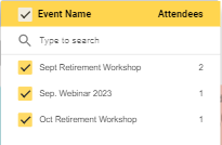
Use this dropdown to select a specific event by its internal name.
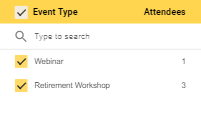
This dropdown shows the event types. For example, workshops or seminars.
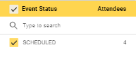
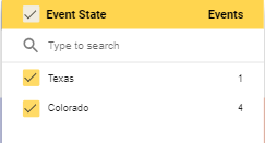
Use this dropdown to see the status of an event. For example, canceled, scheduled, or completed.
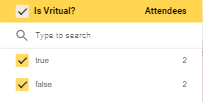
Click on this dropdown to see if it was a virtual event.
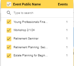
Use this dropdown to select a specific event by its public name.
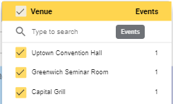
Use this dropdown to select required event venues.
Use this dropdown to specify your search by the state the event is held in.
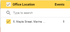
Use this dropdown to view the office location where the event is held.
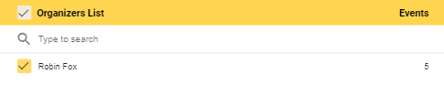
Use this dropdown to view the list of organizers for this event.
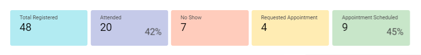
This tab has various metrics to provide you with a glance into the event turnout. These metrics are:
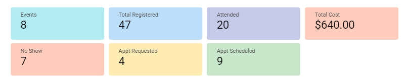
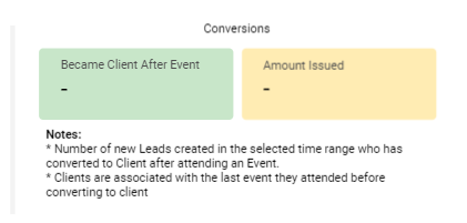
In addition to the above metrics, you'll see the conversion metrics here:
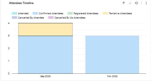
You’ll see different event statistics displayed in bar graphs. Let’s take a look at these graphs:
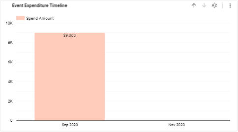
This graph shows the total amount spent on an event and its breakdown by month or year.
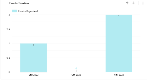
This graph shows how many events you organized per month or year.
This graph displays the event type regarding the month or year it was organized. The event type is color-coded for easy interpretation.

This graph displays the people who registered to attend an event. You can see different attendee statuses such as confirmed, canceled, and attended. These statuses are color-coded for better understanding.
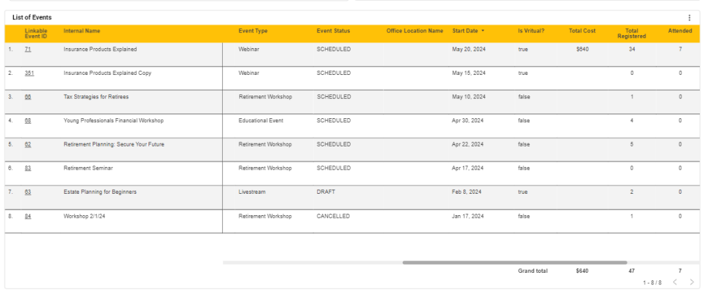
By the end of this report, you’ll see the List of Events. it is a tabular representation of all event-related details. You can see these columns here:
Switch to this tab and you’ll find the total number of attendees. This report provides an extensive view of all attendees based on the status of their attendance, the sources they’re coming from, and the stage of their buyer’s journey.
Let's see the description of filters specific to this tab:
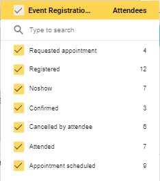
Use this dropdown to see the specific registration status of your leads. For example, registered, no show, confirmed, etc.
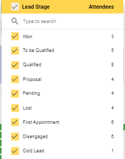
Use this dropdown to select the stage of a lead’s journey. You can customize the lead stages as required.
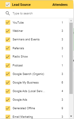
Use this dropdown to select the channels that your leads are coming from. For example, a YouTube ad prompted a lead to register for the event.
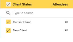
Use this dropdown to see if this client is a new lead or an existing one.
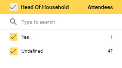
Use this dropdown to see the leads who are decision makers.
The metrics here are same as the Overview tab:
You’ll find three bar graphs in this report.
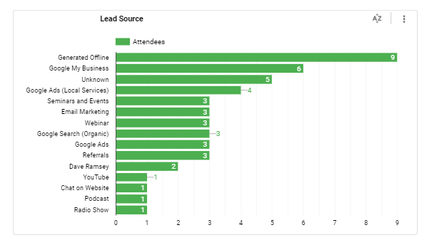
You can see where your leads are generated from. It provides you with a holistic view of digital and traditional channels and helps you direct your marketing efforts accordingly.
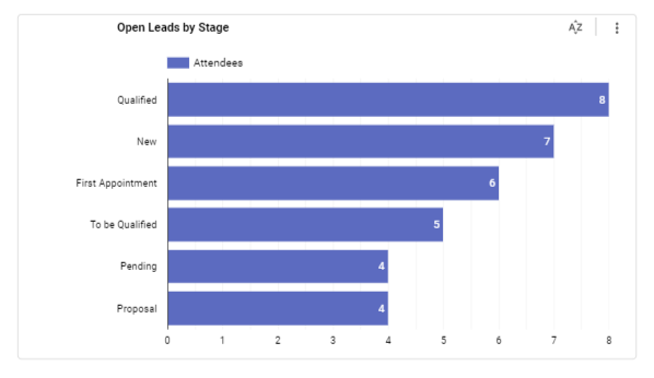
This is where you can see the stage of your lead’s journey. For example, they book a first appointment with you.
After the graphs, you’ll see the following two tables:
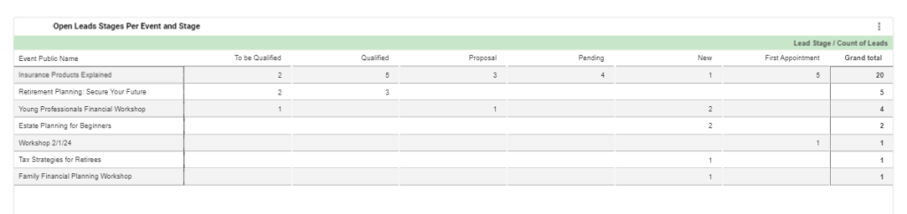
This table helps you view each event by the number of generated leads in different lead stages. You’ll find information in different columns:
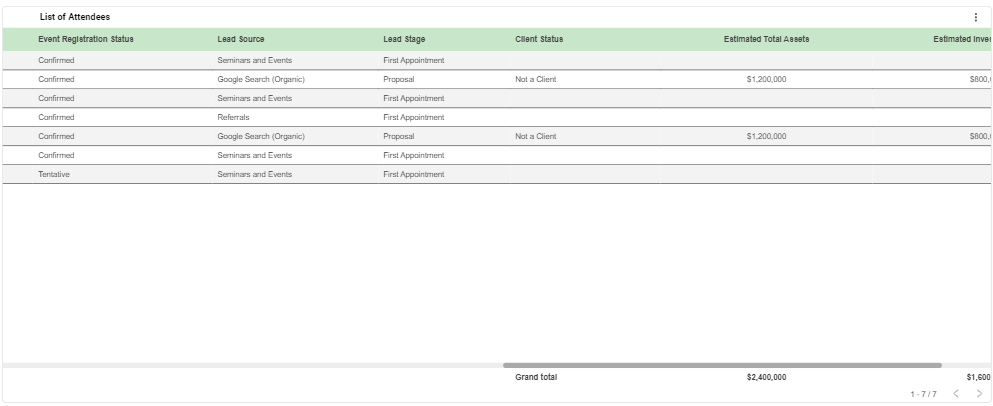
This is the tabular representation of the list of attendees. You’ll find information in different columns:
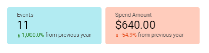
Switch to this tab and you’ll find the total cost of the required event. This dashboard displays the total amount spent and provides a comprehensive view of event-related expenditures.
All the filters in this tab are same as the Overview tab except one.
You’ll find these metrics here:
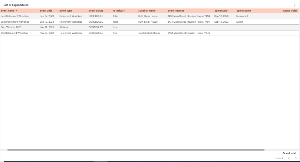
You’ll find the tabular representation of the list of expenditures in this report. The different columns showcase the following information:
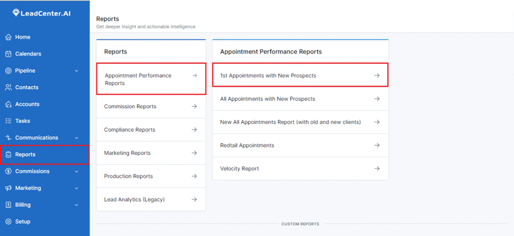
LeadCenter offers dynamic dashboards with metrics that drive value for your financial advisory firm. One of these dashboards is 1st Appointments with New Prospects. This report presents metrics related to your first meeting with a new prospect. Many financial advisors see this first meeting as a make-or-break point which is why dissecting the elements of this meeting and obtaining real-time numbers is what this report will enable you to do.
To access this report, follow these steps:
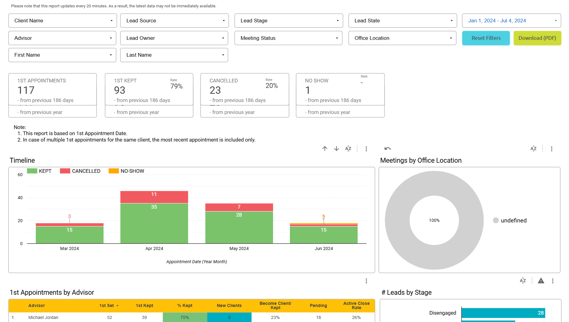
This report consists of different components such as filters, KPIs, charts, and graphs. Each of these components helps you gain a unique insight into the first meeting with a new prospect. Let’s see what these components are:
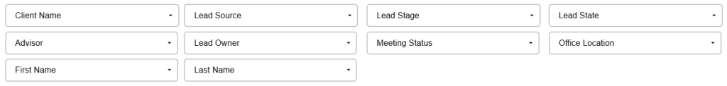
You’ll see different filters on top with drop-down menus to choose from. You can select as many filters as required. Let's take a look at these filters:
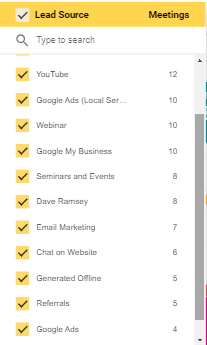
This filter shows where the leads are coming from. For example, YouTube, Facebook, Email marketing, etc.
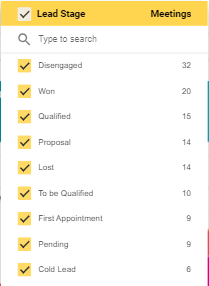
Click on the drop-down menu to see all the stages of a lead’s journey. For example, Won, Lost, Qualified, Disengaged, etc. You’ll also see the number of leads in each stage.
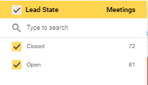
Use this filter to select the state your lead is in. Selecting Open will show leads that are currently processing while selecting Closed will reveal leads that have been converted or lost.
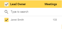
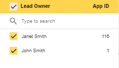
Click on the drop-down menu to select and see the lead’s owner. For example, if you select your name, you’ll see the leads that you brought.
Use this filter to search by financial advisors in your firm.
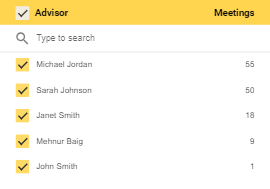
Use this filter to see the advisors managing the leads.
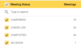
This filter enables you to see the meeting status. For example, you can select the confirmed meetings, the no-shows, cancelled, and completed.
Click on the drop-down menu to see the location of the office.
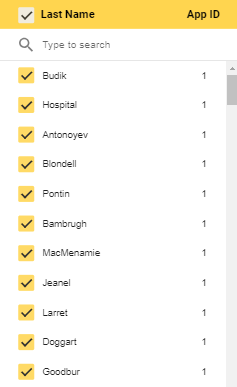
Use this filter to search by the first name.

Use this filter to search by last name.
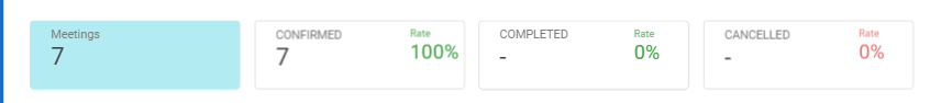
After filters, you’ll see the metrics in the middle of the screen. Each metric is represented with a dedicated tile.
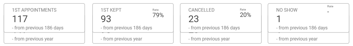
Here’s a brief description of each of these metrics:
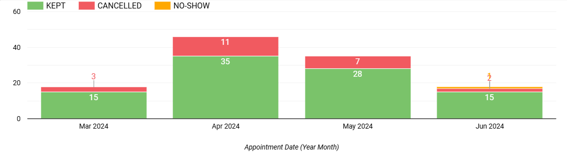
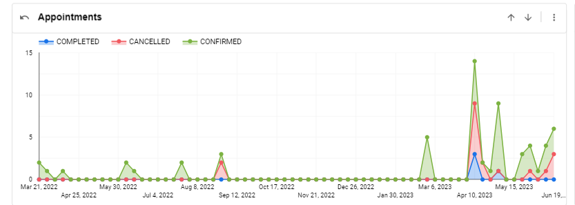
There are different bar graphs to visualize the elements of this report.
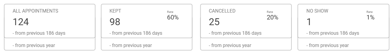
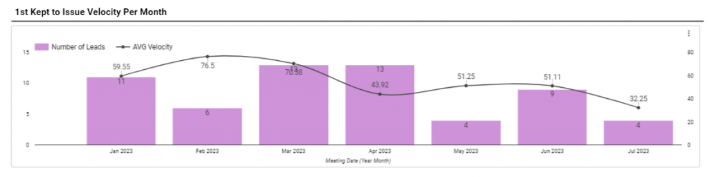
This graph displays the number of appointments based on the day, month, year, and quarter. For instance, you made a total of 50 appointments in the month of June, out of which 42 were kept, 6 were cancelled, and 2 were no-shows.
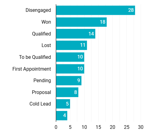
Here you can see the number of leads in various stages of the buyer’s journey. For example, 10 are qualified, 5 are disengaged, 7 are in the first appointment stage, etc.
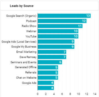
This graph represents the number of leads generated from different sources. This enables you to view sources such as Google Ads, organic searches, referrals, etc.
You'll see a pie chart that represents the percentage of meetings by office locations.
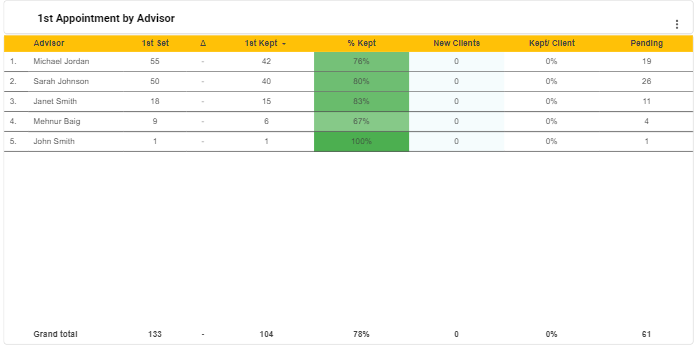
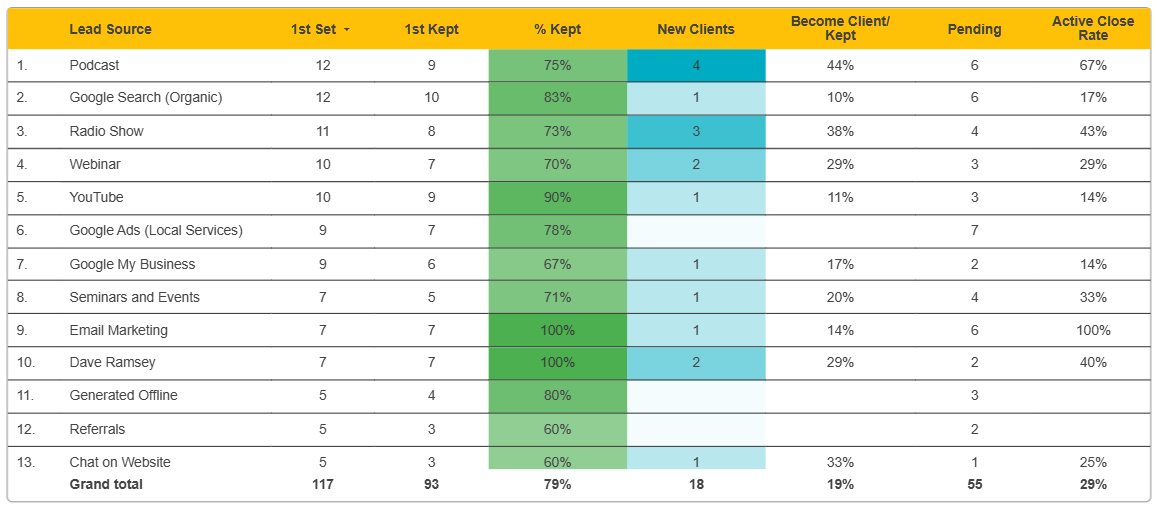
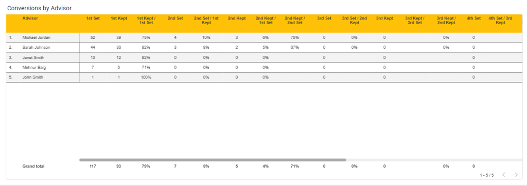
In addition to bar graphs and a pie chart, you’ll see tables displaying the percentage of first appointments based on advisor and source.
This table displays the percentage of kept appointments based on advisor. This enables you to seek a glance into the efficiency of your advisors. The columns here show the percentage of prospects that kept appointments with a specific advisor and how many of them converted or are in pending status.
This table shows the percentage of appointments based on the source. The columns here display the number of prospects coming from various sources.
By the end of this report, you’ll see the tabular representation of the list of appointments. This table consolidates all the appointment-related information and provides a holistic view.
Let’s see the columns in this table:
LeadCenter is purpose-built for financial advisors. The platform provides advanced reporting and analytics for you to better understand the sales and marketing operations of your organization, identify roadblocks, and promote operational efficiency. To ensure proficiency, you can utilize one of our dynamic reports called Appointment Performance Reports - All Appointments with New Prospects.
To access this report, follow these steps:
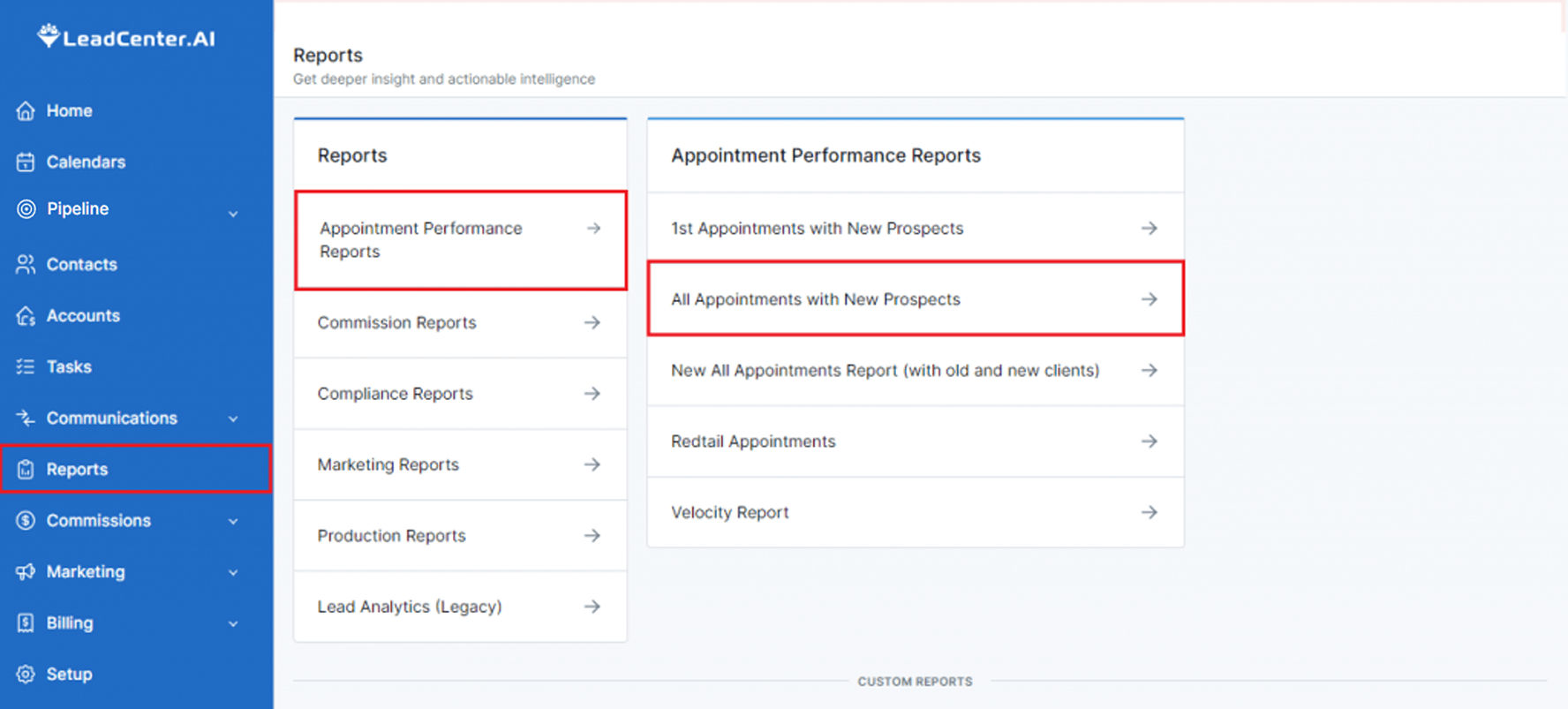
This report consists of different components such as filters, metrics, and tables. The components here help you access the statistics regarding all your appointments with prospects.
You’ll see different filters on top with drop-down menus to choose from. You can select as many filters as required.
The filters that you can use to narrow down your search are:
Use this filter to see a list of advisors.
This filter shows where the leads are coming from. For example, YouTube, Facebook, Email marketing, etc.
Click on the drop-down menu to see all the stages of a lead’s journey. For example, Won, Lost, Qualified, Disengaged, etc. You’ll also see the number of leads in each stage.
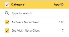
Use this drop-down to see the category of the appointment. For example, 1st visit or 2nd visit.
Use this filter to select the state your lead is in. Selecting Open will show leads that are currently processing while selecting Closed will reveal leads that have been converted or lost.
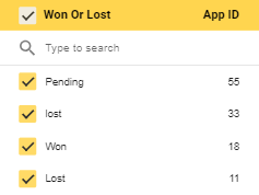
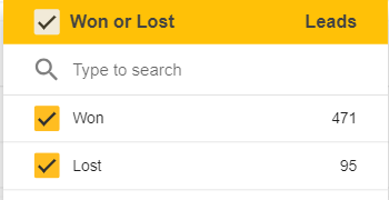
Use this drop-down to see the leads that are won or last.
Click on the drop-down menu to see the location of the office.
This filter enables you to see the meeting status. For example, you can select the confirmed meetings, the no-shows, cancelled, and completed.
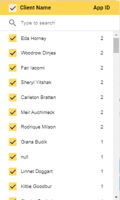
Use this filter to search by the the client's full name.
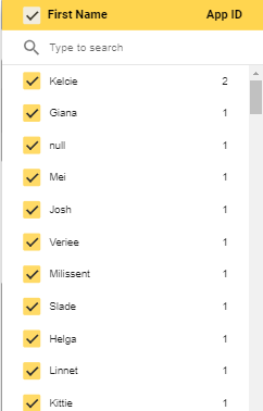
Use this filter to search by the first name.
Use this filter to search by last name.

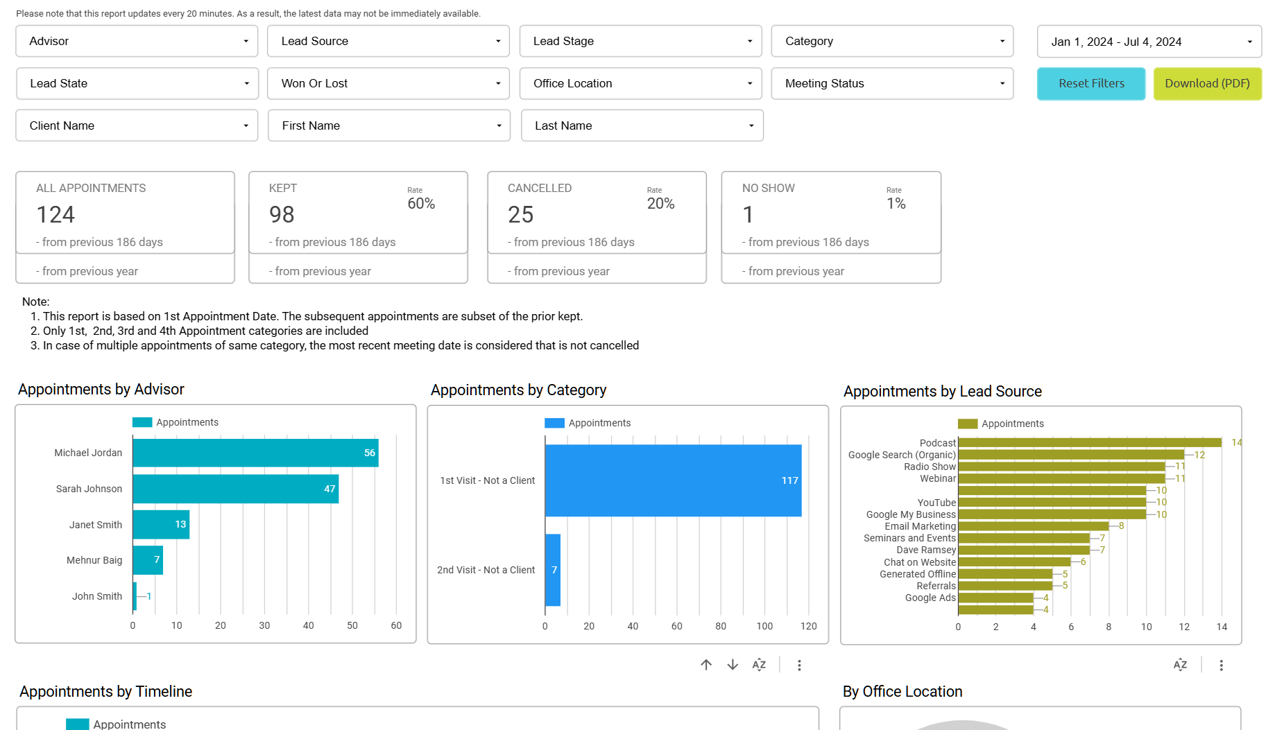
After filters, you’ll see the metrics in the middle of the screen. Each metric is represented with a dedicated tile.
Here’s a brief description of each of these metrics:
After metrics, you'll see bar graphs and a pie chart. It further breaks down the details of appointments with your leads.
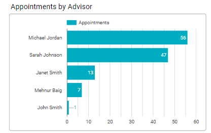
This graph shows the number of appointments each of your advisor is completing.
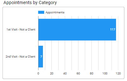
This graph represents the number of appointments that reached the 1st visit and the 2nd visit.
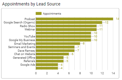
This graph represents the number of appointments generated from different sources. This enables you to view sources such as Google Ads, organic searches, referrals, etc.
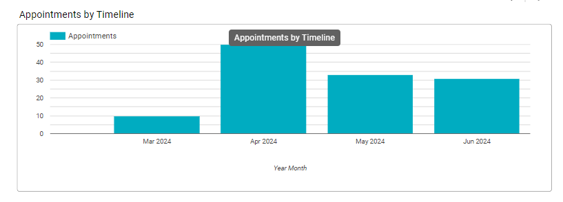
This graph displays the number of appointments based on the day, month, year, and quarter.
You'll see a pie chart that represents the percentage of meetings by office locations.

After bar graphs and a pie chart, you’ll see a table displaying the history of all appointments scheduled and kept, grouped by advisors. You’ll find out which of your advisors are converting prospects into clients and after how many appointments.
This table showcases advisors' performance and enables you to see their progress with each appointment they take point on.
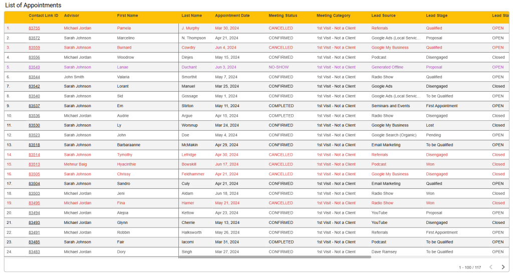
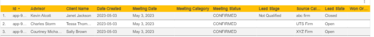
You’ll see the tabular representation of the list of appointments. This table consolidates all the appointment-related information and provides a holistic view.
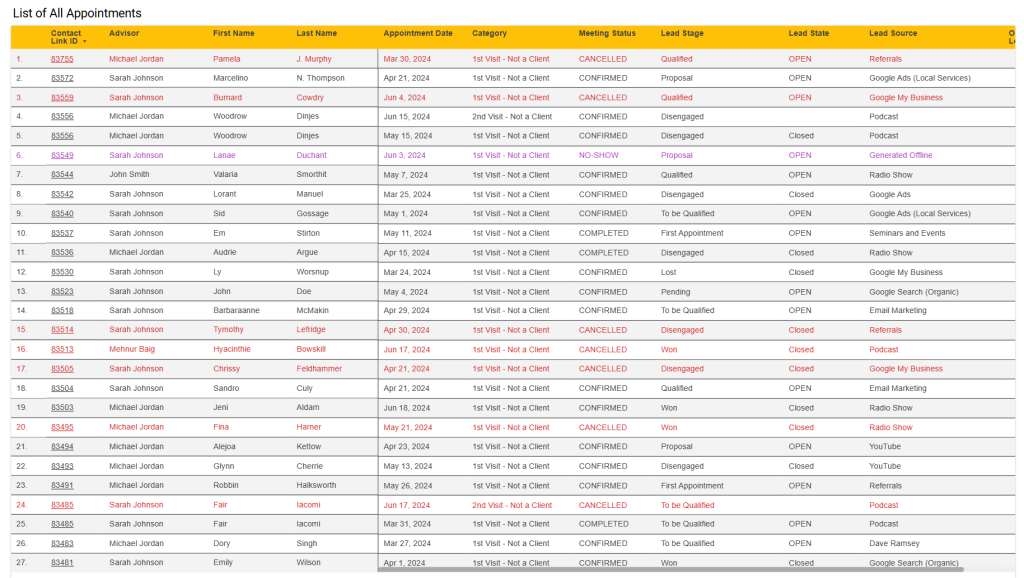
Let’s see the columns in this table:
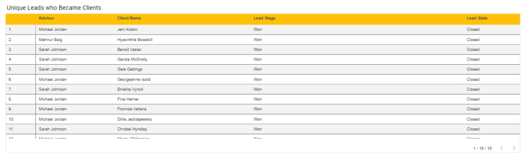
By the end of this report, you'll see a tabular representation of leads who became clients. It showcases the advisors who converted these leads into paying customers.
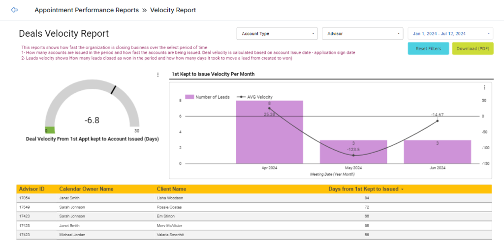
The Deals Velocity Report presents a comprehensive view of how your company finalizes business deals within a specific timeframe. It provides valuable insights into your company’s performance and your ability to convert leads into paying clients within a chosen period of time.
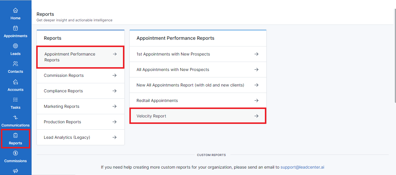
This dashboard has different components to showcase your company’s performance regarding the speed of closing deals. Let’s see what these components are:
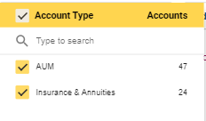
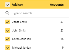
You’ll see the filters on top to specify your search.
This dropdown allows you to select the account type. You can choose AUM or Insurance and Annuities.
Click on this dropdown to select the financial advisor managing the accounts.
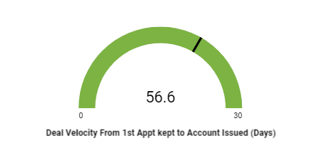
It represents the average number of days from the first appointment with a lead to the day they become a paying client. It reflects how quickly an efficient advisory practice can convert initial meetings into actionable accounts.
The deals velocity index is first represented by a half-pie chart or a speedometer. It presents an overall picture of the average speed with which your company is closing deals.
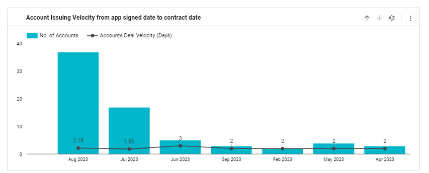
The bar graph presents a granular view of the number of leads from the first meeting to the average number of days till they issue an account.
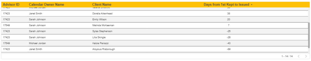
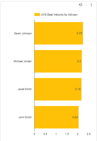
The table shows columns with advisors' and clients’ names. It offers you a unique insight into your advisors’ professional prowess. You can see which advisors are quickly turning leads into clients with accounts.
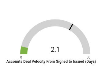
Scroll down on this dashboard and you’ll find another half-pie chart. This chart displays the duration between a client signing the deal and issuing the investable assets.
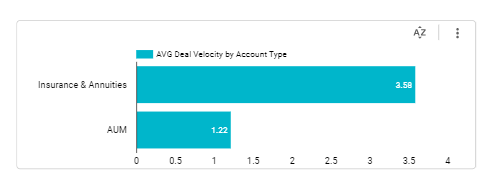
Next to the half-pie chart, you’ll see a bar graph. It showcases the deal velocity regarding the account type. For example, insurance, annuities, and AUM. It enables you to analyze which of these account types get processed quickly and efficiently.
This bar graph represents the time it takes to process your client’s application and finalize the contract.
This bar graph displays the number of days it takes for each individual advisor to finalize a deal. It acts as a performance metric for your advisors and allows you to optimize your operations based on high-performing employees.
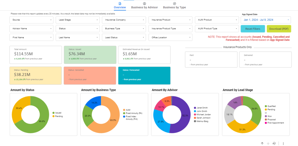
Reporting and analytics help you understand your business operations and enable you to view key performance indicators (KPIs). These KPIs show you different aspects of your financial advisory firm by compiling data into comprehensive reports. One of these reports is the All Production (Issued, Pending, and Cancelled) report which displays all the client accounts information and presents growth-driven statistics.
Follow the steps given below to access the All Production report:
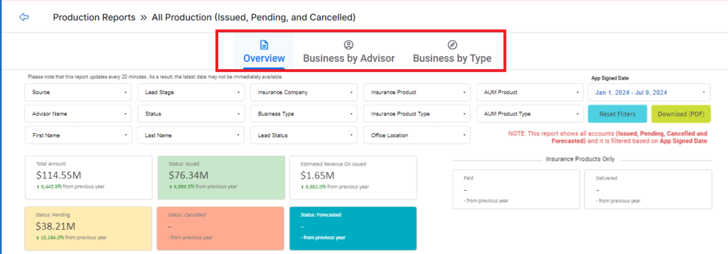
Upon accessing this report, you’ll see three tabs on top. Each tab provides a different kind of report. These tabs are:
The common components of each tab include:
You’ll see the filters on top of the screen. You can click on the required filter dropdown to narrow down your search.
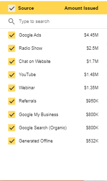
Click on this dropdown to see the different channels your leads are originating from.
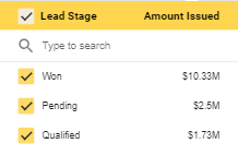
Click on the dropdown to select the stage of a lead’s journey. You can customize the lead stages as required.
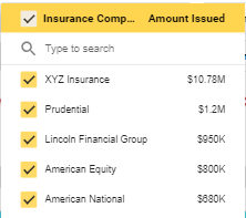
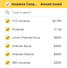
Click on this dropdown to select the accounts for a specific insurance company. You can select the required insurance company from a list of companies.
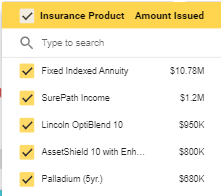
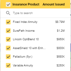
Click on the dropdown to see the accounts for a specific insurance product.
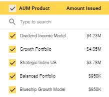
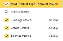
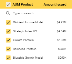
Click on the dropdown to see the accounts for a specific AUM product.
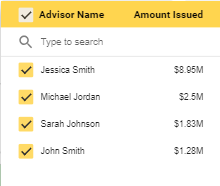
Click on this dropdown to select the writing advisor managing the accounts.
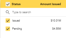
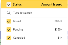
Click on the dropdown to select the status of the account. For example, issued or pending.
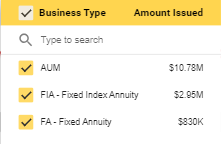
This dropdown allows you to select the account type. For example, AUM or annuity.
Click on the dropdown to choose the insurance product type.
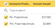
Click on the dropdown to choose the insurance product type.
Use this filter to search by the first name.
Use this filter to search by last name.
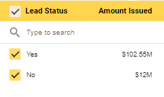
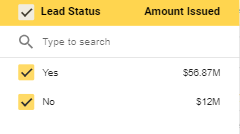
Click on the drop-down menu to see lead status.
Click on the drop-down menu to see the location of the office.
After the filters, you can see the following metrics at-a-glance:
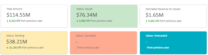
Here’s a brief description of these metrics:
This is the total amount that your company is handling for the clients.
The amount that has been issued to your company.
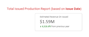
The estimated revenue calculate from the issued amount.
The amount that is yet to be received.
The number of accounts that were cancelled.
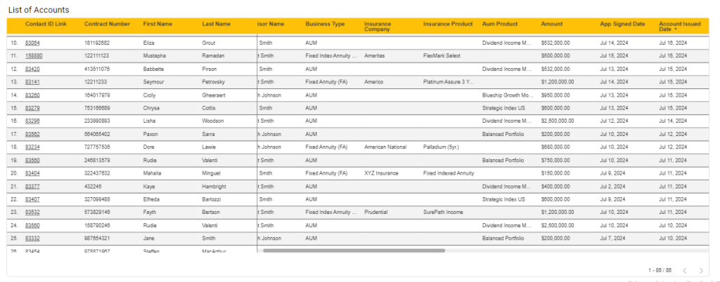
By the end of each report, you’ll find a table with different columns each representing a different element of the client accounts.
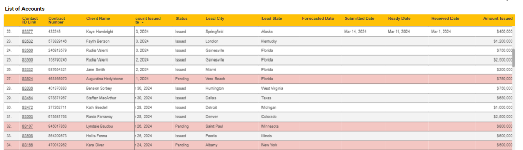
You can switch between tabs to see the components specific to each tab. Let’s see the components of the Overview report:

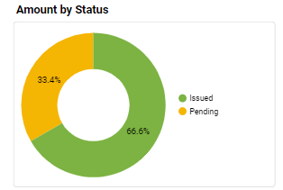
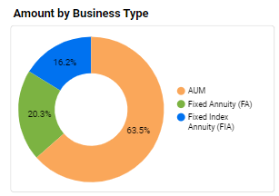
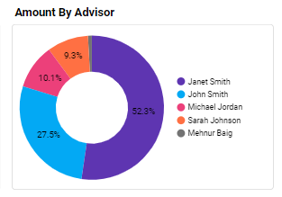
You’ll see pie graphs displaying different business information in percentages.
This graph shows the percentage of accounts in issued, pending, cancelled, and closed status.
This graph represents the percentage of business types associated with client accounts. For example, your company is handling 60% AUM, 20% fixed annuity, and 20% fixed index annuity accounts.
This graph shows advisors’ contribution to managing clients’ accounts.
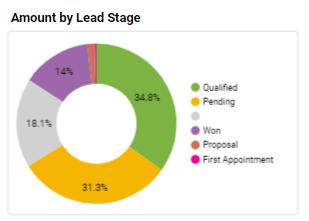
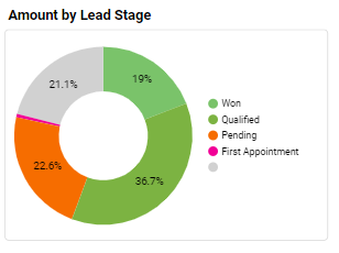
This graph shows the stages of a lead’s journey. For example, 30% of your leads are pending, 30% are qualified, and 40% are won.
You’ll see bar graphs that represent the amount issued and pending by:
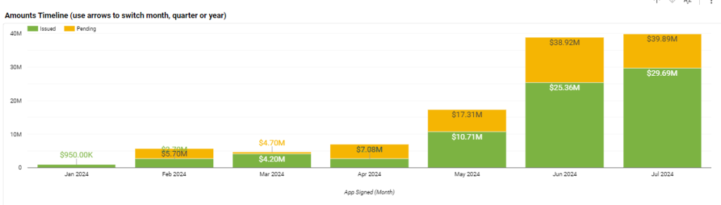
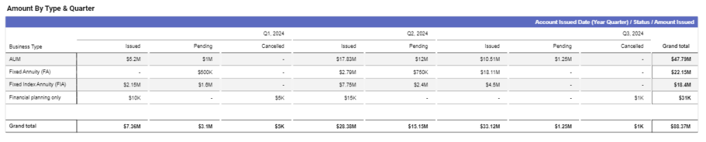
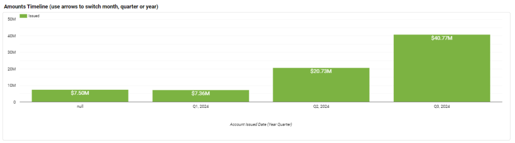
This graph represents the amount issued, pending, cancelled, and closed by month, quarter, and year.
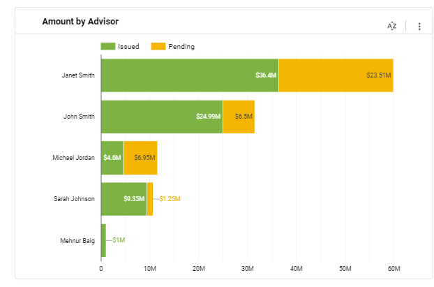
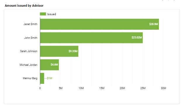
This graph shows the amount issued and pending by the advisor handling that account.
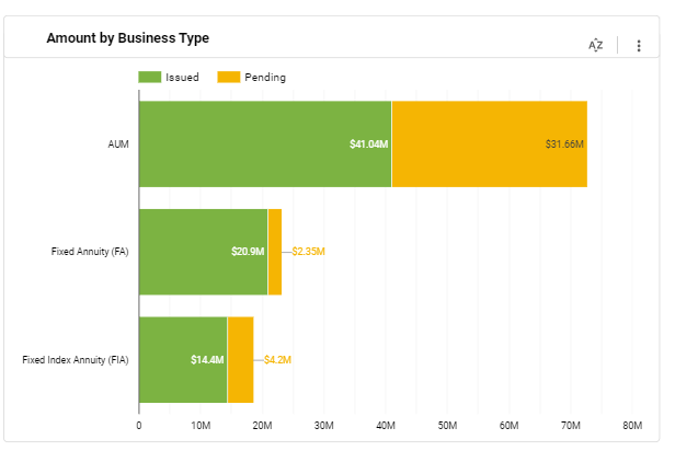
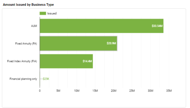
This graph shows the issued, pending, cancelled, and closed accounts for fixed annuities, fixed index annuities, and AUM.
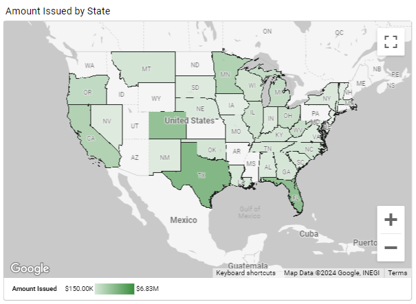
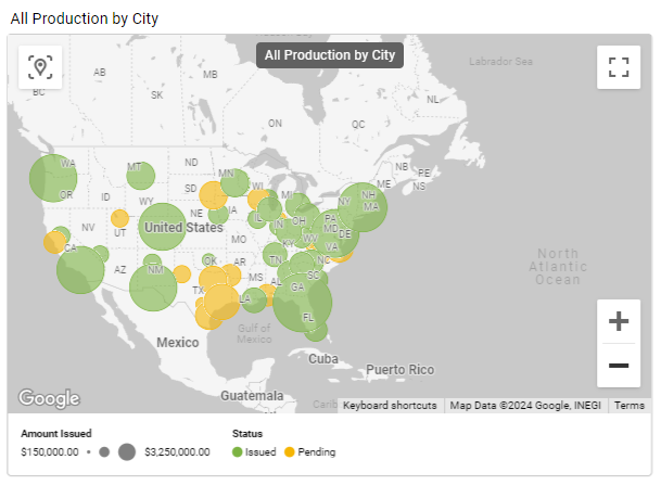
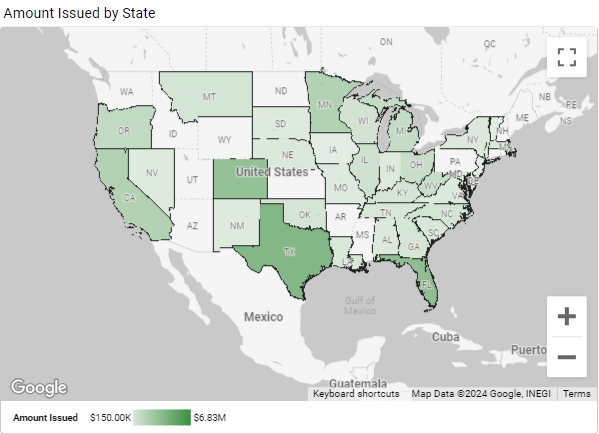
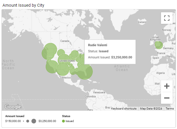
You can also get a holistic view of the production reports by state and city on the maps included within this report.
Amount Issued by State
All Production by City
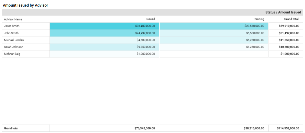
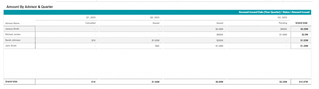
Switch to this tab and you’ll find tables showcasing the business metrics associated with each advisor.
This table shows the total amount each advisor is managing. You can see these columns:
This table further elaborates on the total amount each advisor is handling per quarter. You can see the same columns as above, the only difference is that these columns are grouped by quarters.
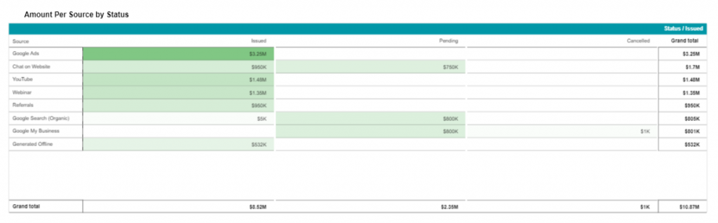
This table showcases the main channels that your leads are generated from. The columns here represent the leads that come from certain sources and are now clients with accounts. This enables you to view the channels that bring the highest money flux.
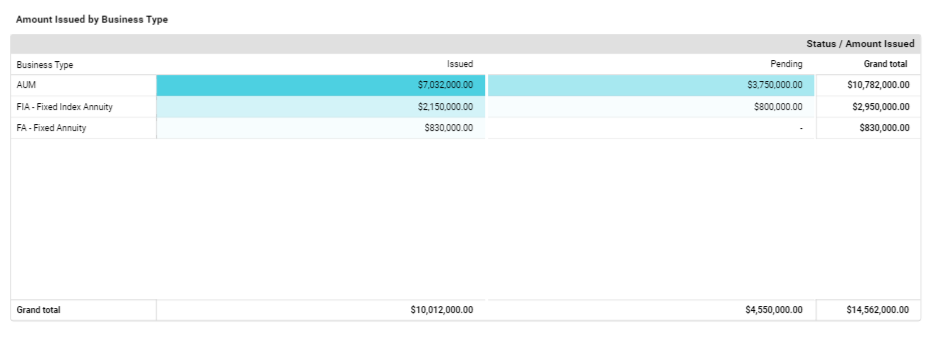
This is the default tab that you’ll see when you access the All Production report. This is specifically for the business owners to view the insurance/AUM products and the amount associated with each one.
This table displays insurance/AUM products and the amount each product is bringing in.
This table represents the amount issued for products, and groups it by each quarter.
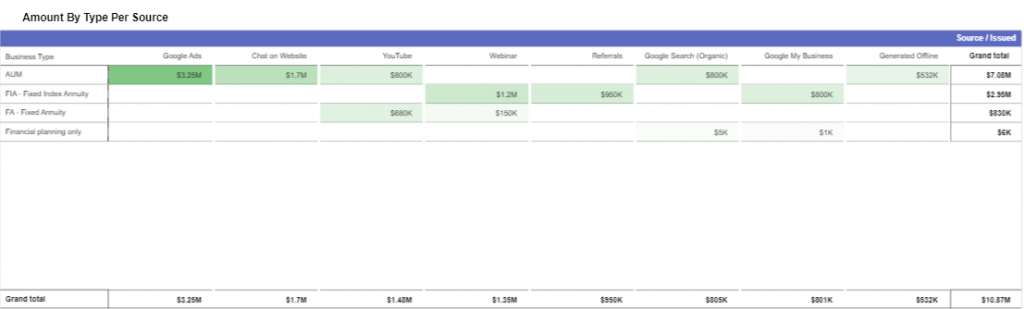
This table displays all the products in the first column and dedicates all other columns to the sources the leads come from. This enables you to view the sources which bring the highest flux of money.
The Issued Productions report presents the clients' accounts based on the date the investable amount was issued. With this article, we'll delve deeper into the components of this dashboard.
Follow the steps given below to access the All Production report:
The components of this report include:
You’ll see the filters on top of the screen. You can click on the required filter dropdown to narrow down your search.
Click on this dropdown to see the different channels your leads are originating from.
Click on the dropdown to select the stage of a lead’s journey. You can customize the lead stages as required.
Click on this dropdown to select the accounts for a specific insurance company. You can select the required insurance company from a list of companies.
Click on the dropdown to see the accounts for a specific insurance product.
Click on the dropdown to see the accounts for a specific AUM product.
Click on this dropdown to select the writing advisor managing the accounts.
Click on the dropdown to select the status of the account. It shows you how much amount has been issued.
This dropdown allows you to select the account type. For example, AUM or annuity.
Click on the dropdown to choose the insurance product type.
Click on the dropdown to choose the insurance product type.
Use this filter to search by the first name.
Use this filter to search by last name.
Click on the drop-down menu to see the location of the office.
On the left side, you'll see metrics for Insurance Products Only:
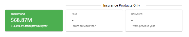
On the right side, you'll see Total Issued Production Report (based on Issued Date):
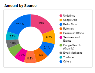
You’ll see pie graphs displaying different business information in percentages.
This graph represents the percentage of leads generating from various channels. For example, 30% of your leads are coming from email marketing, 20% from Google ads, and remaining 50% from YouTube, referrals, and organic search.
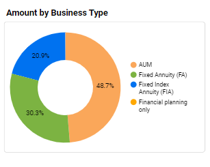
This graph represents the percentage of business types associated with client accounts. For example, your company is handling 60% AUM, 20% fixed annuity, and 20% fixed index annuity accounts.
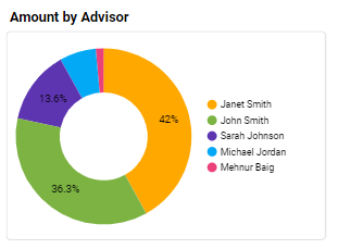
This graph shows advisors’ contribution to managing clients’ accounts.
This graph shows the stages of a lead’s journey. For example, 30% of your leads are pending, 30% are qualified, and 40% are won.
You’ll see the following bar graphs
This graph represents the amount issued by month, quarter, or year:
This graph shows the amount issued and pending by the writing advisor managing that account.
This graph shows the issued, pending, cancelled, and closed accounts for fixed annuities, fixed index annuities, and AUM.
You can also get a holistic view of the issued amount report by state and city on the maps included within this report.
By the end of this report, you’ll find a table with different columns each representing a different element of the client accounts.
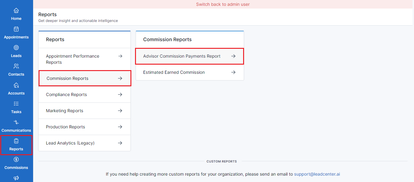
LeadCenter presents Advisor Commission Payments Report for managing advisors’ commission payments transparently and efficiently. This dashboard offers a comprehensive view of advisors’ commission earnings and empowers you to make informed decisions based on real-time data. You can get insight into the total commission that the advisors are bringing in and track their success accordingly.
To access the dashboard, follow the steps given below:
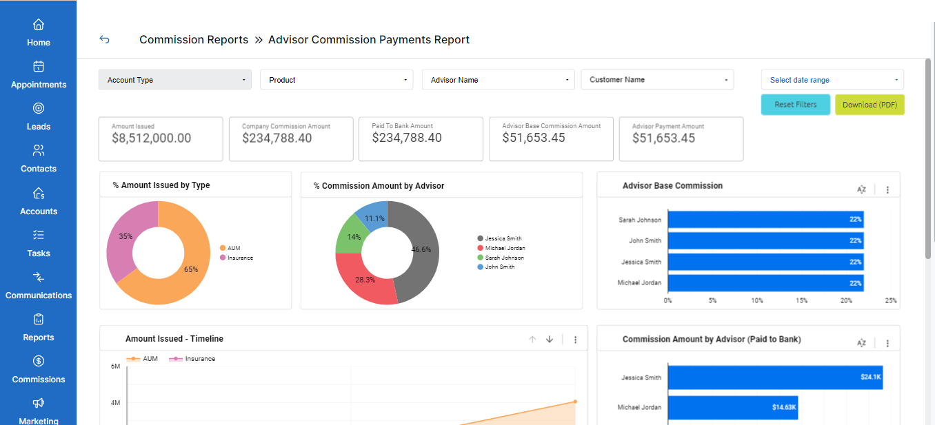
This dashboard contains dynamic components and enables you to apply filters to narrow down your search. You can also view different pie charts, line and bar graphs, and a tabular representation of the advisors’ accounts management activities.
You can see filters as dropdown buttons on the top of this dashboard. Let’s see what these filters represent:
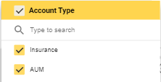
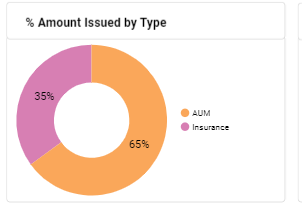
This dropdown reveals the account types the advisors are managing. For example, an insurance account or AUM products.
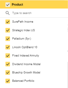
Click on this dropdown to see a list of insurance and AUM products to choose from.
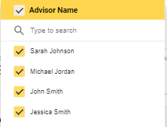
Use this dropdown to select the specific advisor and view statistics.
Click on this dropdown to select the required customer.
After the filters, you can see different metrics at-a-glance. These metrics are:

Here's a brief description of each of these metrics:
The total investable amount issued by the client.
The estimated fee for your company.
The amount received in the company’s bank.
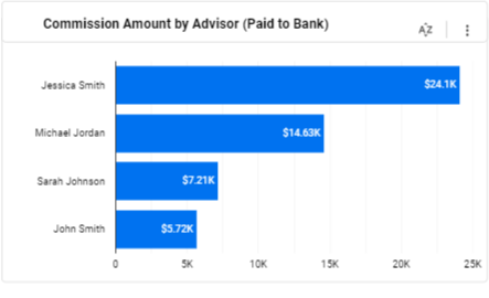
The commission amount for advisors.
The total amount paid to the individual advisors.
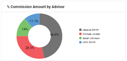
You can see two pie charts, each representing different statistics.
This pie chart reflects the percentage of the amount according to the account type.
This chart shows how much each advisor is making from the total commission amount.
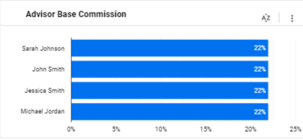
You’ll see two bar graphs reflecting different statistics.
This graph shows the advisors’ commission percentage for the account they’re managing.
This graph shows the actual amount paid to the company for each individual advisor.
The bar graphs offer some other functions as well. Click on the three-dot menu on the right side of the graph to reveal these options:
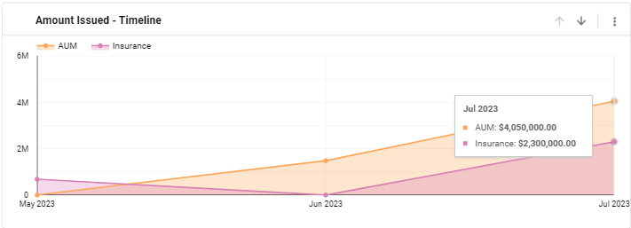
You can see one line graph representing the investable assets correlating with the required timeline.
This graph shows the total amount issued by clients within a specific timeline.
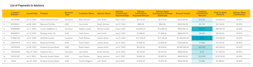
By the end of this dashboard, you’ll find a table with different columns each representing a different element of the Advisor Commission Payments Reports.
You’ll see the following columns in this table:
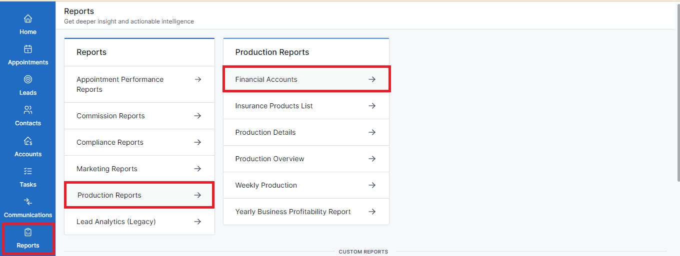
Data consistency, advanced metrics, and holistic reports enable you to make data-centric decisions and drive growth to your business. LeadCenter provides all that and more with its interactive dashboards. One such dashboard is the Financial Accounts dashboard. You can view all accounts in one place and access relevant information.
Follow the steps given below to access the Financial Accounts dashboard:
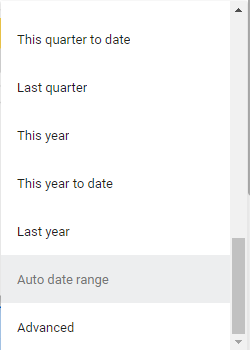
In addition to accessing the Financial Reports dashboard, you can select a date range to view lead activity. Just click on the Select date range dropdown on the top right side of the screen.
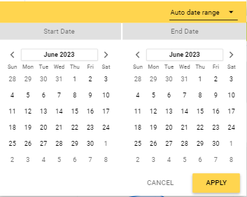 Select from a number of options and view yearly, quarterly, monthly,
weekly, and daily analytics.
Select from a number of options and view yearly, quarterly, monthly,
weekly, and daily analytics.
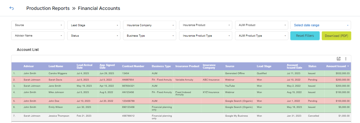
The Financial Accounts dashboard is easy-to-follow and provides a glance at the accounts and relevant details. It helps you view the list of client accounts and associated sales processes.
Let’s explore the components of this dashboard:
On the top of the page, you’ll see filters to narrow down your search.
Click on the dropdown to see the channels that your leads are coming from. For example, a YouTube ad prompted a lead to inquire about your services.
Click on the dropdown to select the stage of a lead’s journey. You can customize the lead stages as required.

Click on this dropdown to select the accounts for a specific insurance company. You can select the required insurance company from a list of companies.
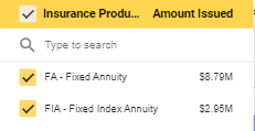
Click on the dropdown to see the accounts for a specific insurance product.
Click on the dropdown to see the accounts for a specific AUM product.
Click on this dropdown to select the financial advisor managing the accounts.

Click on the dropdown to select the status of the account. You can select from Issued, Pending, or Cancelled.
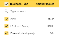
This dropdown allows you to select the account type. You can choose from Insurance, AUM, or Financial Planning Only.
Click on the dropdown to choose the insurance product type.
Click on the dropdown to choose the AUM product type.
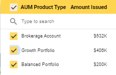
After the filters, you’ll see all accounts listed in a tabular format. You can view different columns with related information.
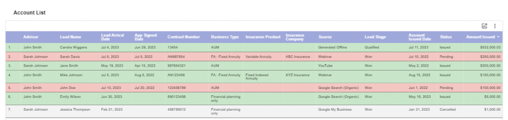
The Account List table offers some other functions as well. Click on the three-dot menu on the right side of the table to reveal these options:
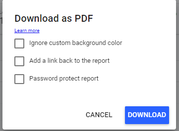
In addition to the filters, you can see two buttons on the top right side of each report:
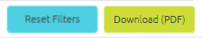
You can use this button to download the required analytics report as a PDF. Follow the steps below:
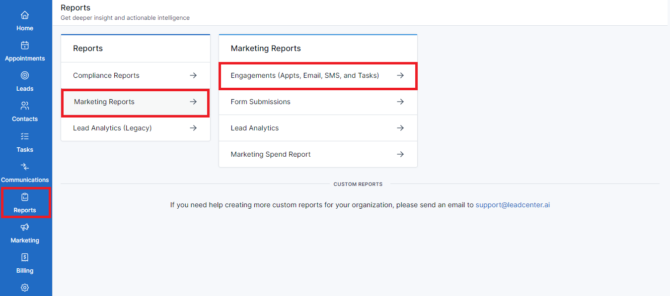
LeadCenter provides different marketing reports for you to monitor and track daily activities, analyze the outcome of marketing efforts, and make informed decisions. This comprehensive tool helps you visualize various metrics in a more digestible format. The Engagements dashboard presents you with the following engagement metrics:
To access engagement reports, follow these steps:

In addition to accessing the engagements reports, you can select a date range to view lead activity.
Select from a number of options and view yearly, quarterly, monthly,
weekly, and daily analytics.
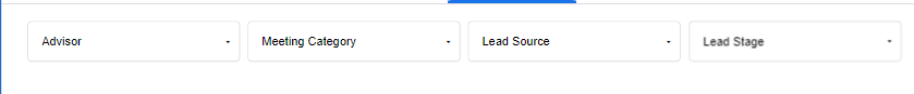
Upon accessing the engagements reports, the default view is for the appointments. Here you can view all meetings you scheduled with clients over the selected date range.
The filters here are
You can see the performance metrics below the filters. These metrics are:
You’ll see two graphs representing the appointments:
This graph shows the meetings in accordance with the dates these were created.
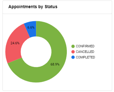
This pie chart shows the percentage of appointment status. For example, 10% of the scheduled appointments were confirmed, 20% were canceled, and 5% got completed.
By the end of this page, you’ll see a tabular display of all appointments. The table, List of Appointments, houses all appointments and has various columns to contain relevant information regarding an appointment. These columns are:
The List of Appointments table offers some other functions as well. Click on the three-dot menu on the right side of the table to reveal these options:
Switch to the emails tab and view valuable information about your email engagement efforts and make data-driven decisions for precise targeting. Here you can see how the emails are performing, and identify the ones that are resonating more with your target audience.
You’ll see different performance metrics at the top of this page. These metrics are:

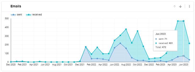
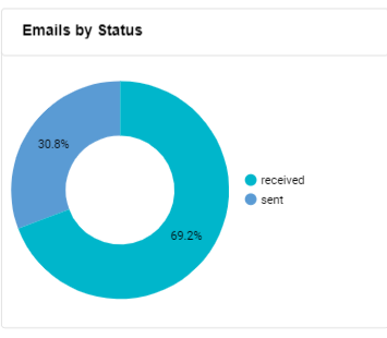
You’ll see two graphs representing the emails:
This graph displays the emails sent during the required date range.
This pie chart shows the percentage of emails with different statuses. For example, 60% sent, and 40% received.
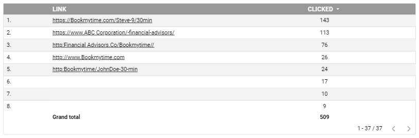
You can see a table with a list of links and a column next to it for the number of times the link was clicked.
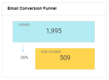
For a simpler view of how email marketing takes place, scroll down to the end of this page and see the email conversion funnel. It enables you to take a quick glance at how the emails work and generate views and clicks.
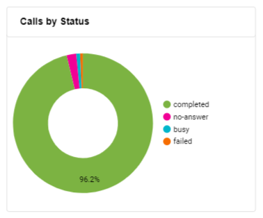
Switch to the calls tab and view the statistics of your inbound calls. The metrics here enable you to better understand customer interactions and improve engagement.
You can view the following performance metrics here:

You’ll see two graphs representing the inbound calls statistics:
This graph displays the total inbound calls received during the required date range.
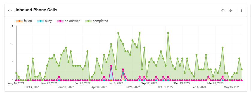
The pie chart displays the percentage of completed and no-answer calls. It helps you better allocate resources to the calls not getting answered.
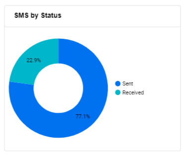
You can go to the SMS tab and view the message-related statistics. This enables you to measure the performance of SMS as a potential marketing channel.
You can view the following performance metrics here:
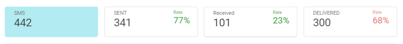
You’ll see two graphs representing the incoming and outgoing messages:
This graph displays the total number of messages sent and received during the required date range.
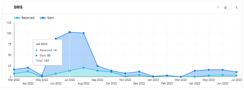
The pie chart displays the percentage of sent and received messages.
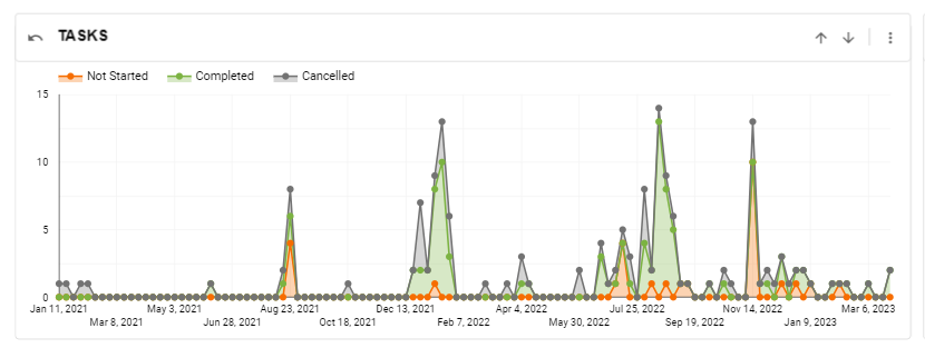
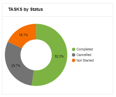
You can go to the tasks tab and view metrics for tasks. It corresponds with the daily task management of your account and keeps track of all tasks-related activities.
You can view the following performance metrics here:

You’ll see two graphs representing the completed, canceled, and not started tasks:
This graph displays the total number of tasks during the required date range.
The pie chart displays the percentage of completed, canceled, and not started tasks.
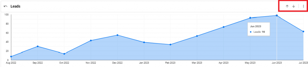
All of the Engagements reports are represented by individual line graphs. On the right side of each of these graphs, you'll see two arrows and a three-dot menu.
Use the upward arrow to have a bird's eye view of each report.
Use the down arrow to have a more detailed view of the required report.
Alternatively, you can click on the three-dot menu to Drill up, Drill down, Reset, and Export lead generation data.

In addition to the filters, you can see two buttons on the top right side of each report:
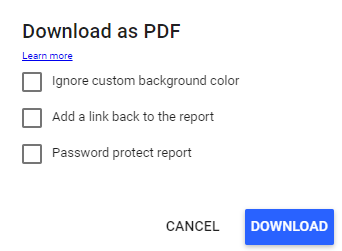
You can use this button to download the required analytics report as a PDF. Follow the steps below:
Click Download to proceed or
Cancel to go back.
Lead Analytics refers to tracking and analysis of lead-related information. In simple terms, lead generation analytics helps track lead-related activities and enables you to make informed decisions. LeadCenter offers a holistic dashboard to view and monitor different reports regarding lead activity. Here’s what you can view at a glance:
To access the lead analytics dashboard, follow these steps:
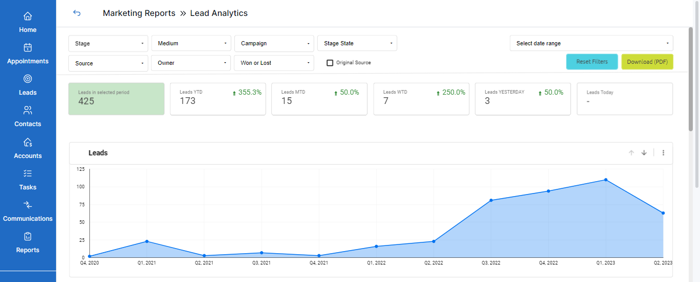
You’ll see different filters on top with drop-down menus to choose from. You can select as many filters as required.
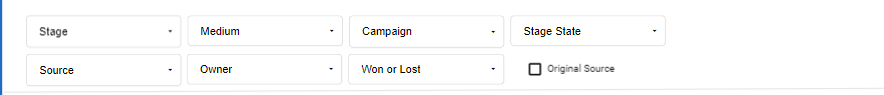
The filters that you can use to narrow down required lead information are:
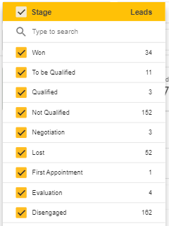
Click on the drop-down menu to see all the stages of a lead’s journey. For example, Won, Lost, Qualified, Negotiation, etc. You’ll also see the number of leads in each stage.
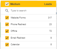
Click on the drop-down menu to select the mediums your leads are using to reach you. For example, Zapier, Redtail, Website Forms, etc.
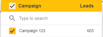
Click on the drop-down menu to view the leads generated as a result of a campaign.
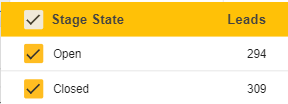
Click on the drop-down menu to select one or both stages of a lead’s journey. Selecting Open will show leads that are currently processing while selecting Closed will reveal leads that have been converted or lost.
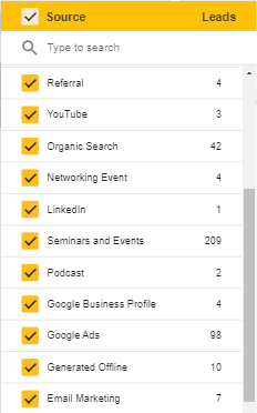
Click on the drop-down menu to see where the leads are coming from. For example, Youtube, Facebook, Email marketing, etc.
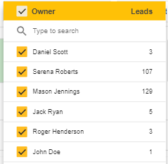
Click on the drop-down menu to select and see the lead’s owner. For example, if you select your name, you’ll see the leads that you brought.
Click on the drop-down to see won or lost leads.
In addition to the filters, you can see three more buttons on the top right side of this dashboard:
You can use this button to download the analytics report as a PDF. Follow the steps below:
There are different marketing performance metrics regarding lead generation data. It displays the number of leads generated:

You can visualize the generated leads in graph form. On the right side of this graph, there are two arrows and a three-dot menu.
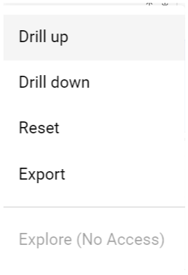
Use the upward arrow to have a bird's eye view of leads generated.
Use the down arrow to have a more detailed view of leads generated.
Alternatively, you can click on the three-dot menu to Drill up, Drill down, Reset, and Export lead generation data.
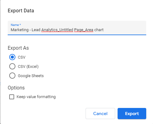
To export this data, follow these steps:
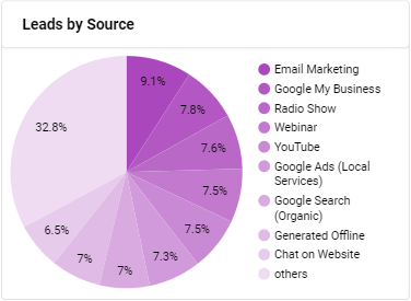
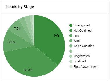
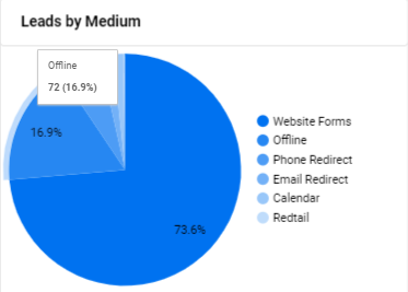
Scrolling down this dashboard, you’ll see pie charts representing the leads generated by:
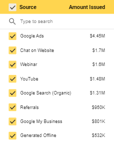
Here you’ll see all the sources the leads are coming from. The source with the highest percentage enables you to target your marketing efforts accordingly.
This pie chart displays the different stages that a lead goes through. You can view the current stage of leads and take proactive measures. For example, focusing on nurturing qualified leads or moving forward with the won leads.
This chart shows you the path your leads are taking to get to you. It enables you to target the mediums with the highest percentage. For example, if most of the incoming leads are using Chat as a medium to communicate, you should be investing in customer support and automation.
Scroll down to the end of the page and you’ll find a tabular representation of leads categorized by source and current stage. Here’s how this works:
For example, 10 out of 50 incoming leads from email marketing are in the Qualified stage, 2 are in the Spam stage, 10 are in the Lost stage, and 3 are already existing customers.
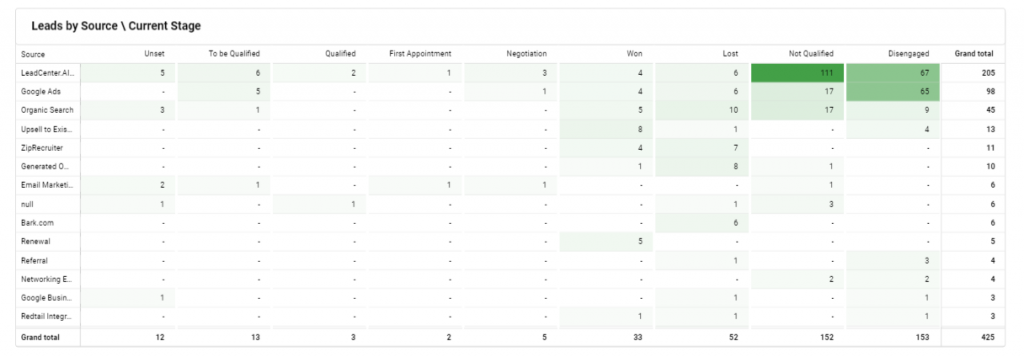
This tabular display of all your leads in different stages along with the source they’re coming from enables you to take account of your marketing tactics. You can tailor your marketing strategies to the source that is generating the highest lead-to-conversion rate.